
HRP Group
Created: 2024, Pilot Apprenticeship
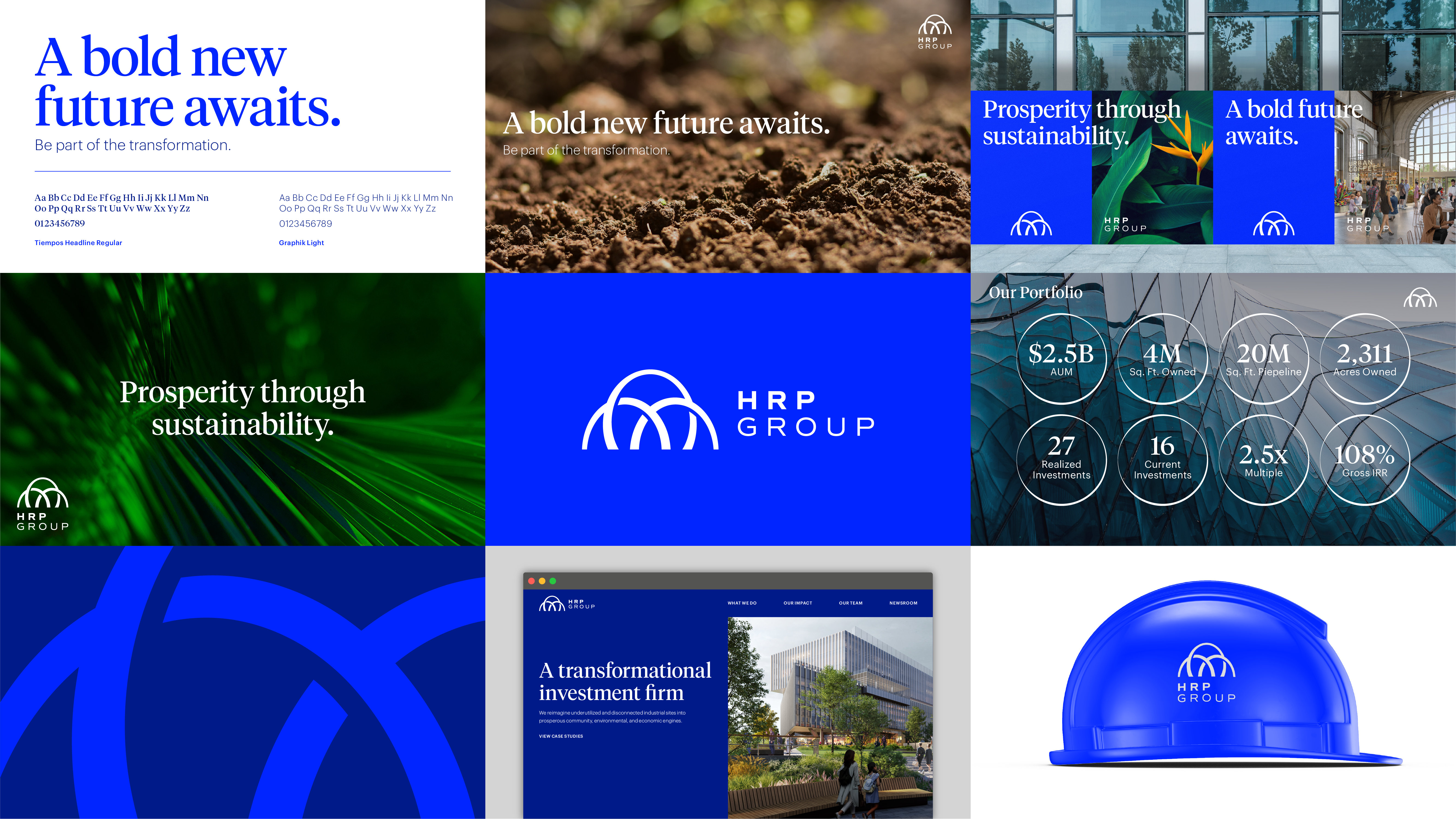
Formerly Hilco Redevelopment Partners, HRP Group has become an employee majority owned company looking for a new identify to distinguish and highlight their new future.
As the design apprentice, my role in the beginning stages of this rebrand, was to assist in the exploration of alternate qualifiers that felt unique and conveyed the new HRP identity better than just Group. After a multitude of iterations, and looking at a variety of ways to capture HRP’s growth and development, it was ultimately decided that in this case, less was more, and HRP Group was the answer.
With the name established, the design team began exploring possible identities that represented different aspects of HRP Group and how they would present themselves to the public. The three categories explored were institutional (giving HRP Group a professional and foundational approach), transformational (to portray a dynamic and ambitious company), and generational (to appeal to the humanistic side of their work and community approach).
In order to convey the strength behind HRP Group, I turned to arches, structural feats of architecture that symbolize stregth and balance. Additionally, the HRP Way contains three pillars, each objective interwined within the others to create the foundation on which HRP works. The resulting identity is the collaboration of the design team and one of the four proposed identities for the future of HRP Group.

old logo
new colors
Bringing new life into an old color palette, the new blues are bold and unapologetic in their strength, coming from a traditionally institutional color palette but standing out from the rest.

Iterations
In the beginning of the iterating phase, my logos had a strong nature influence. HRP Group has a strong focus on the environment and sustainability that sets them apart from other real estate companies. Moreover, the process of a flower blooming was representational of HRP’s redevelopment of obsolete land into flourishing community spaces. My challenge was to create a floral logo that fit within the institutional identity space. It was only through an extensive exploration of petals that I was able to turn to an architectural approach to the logo.

