
200 Clarendon & The Two Hundred Club
Created: 2024, Pilot Apprenticeship
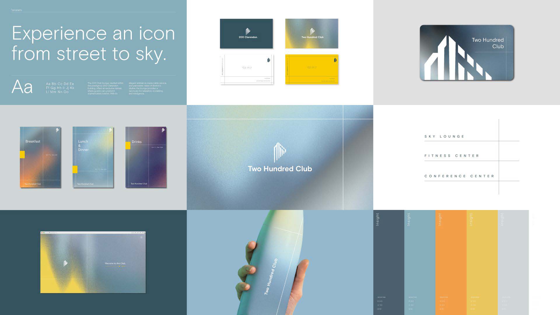
200 Clarendon is an iconic part of Boston. and one of the most recognizable buildings in the city skyline. It is a premier workspace for tenants and home to leading financial and investment firms. As such, BPX was looking to update the current identity of 200 Clarendon while also creating a new identity for the new private luxury amenity club for its tenants, featuring a suite of amenities including a boutique fitness center, lounge, and conference center.

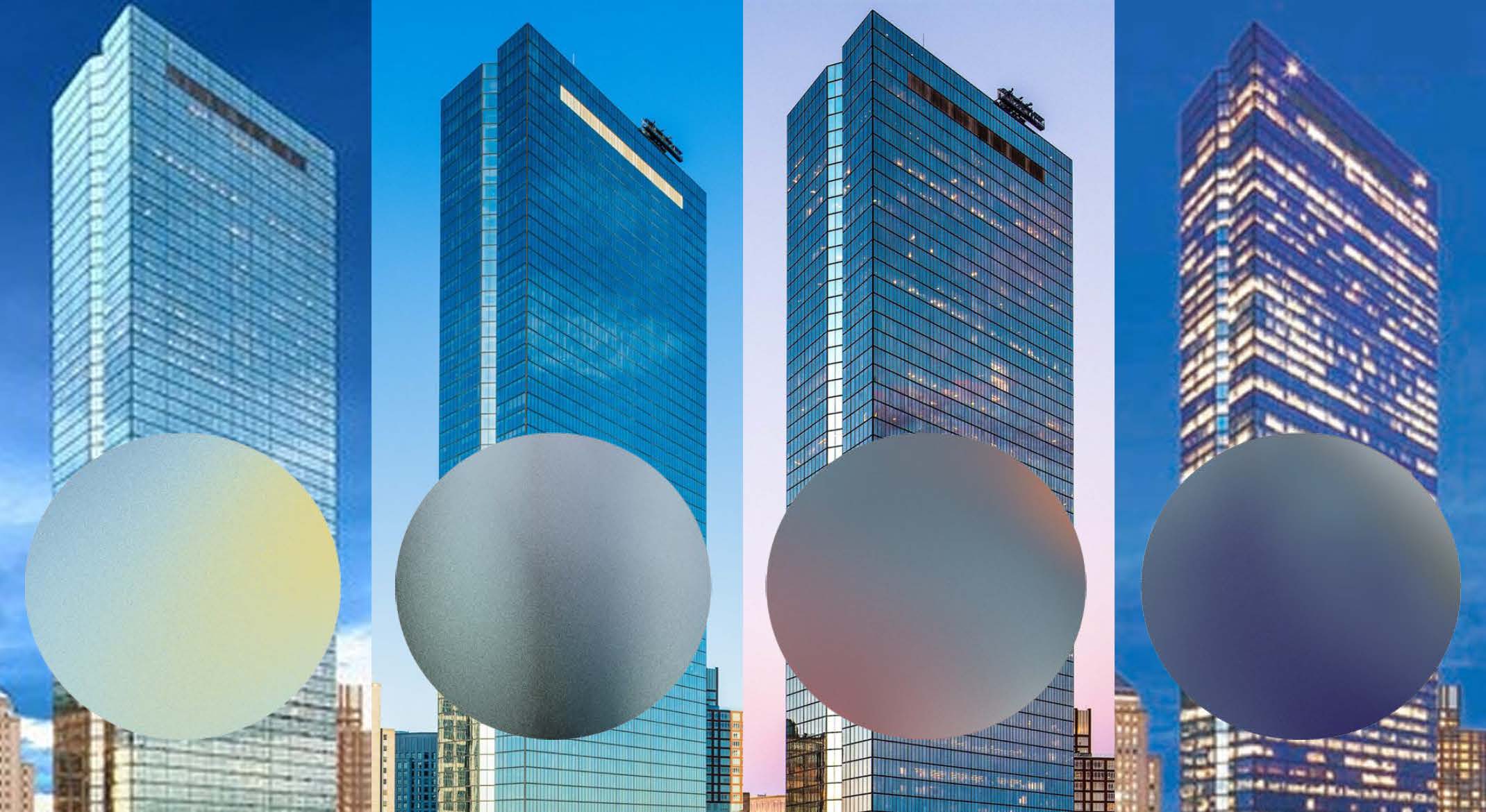
The current logo, below, depicts the building reduced to its most basic forms: a trapezoid, a line, and a triangle. And yet, it is still recognizable, a testament to how essential this building is to Boston. Known for reflecting the environment around it, the gradient within the logo alludes to the reflective glass exterior.
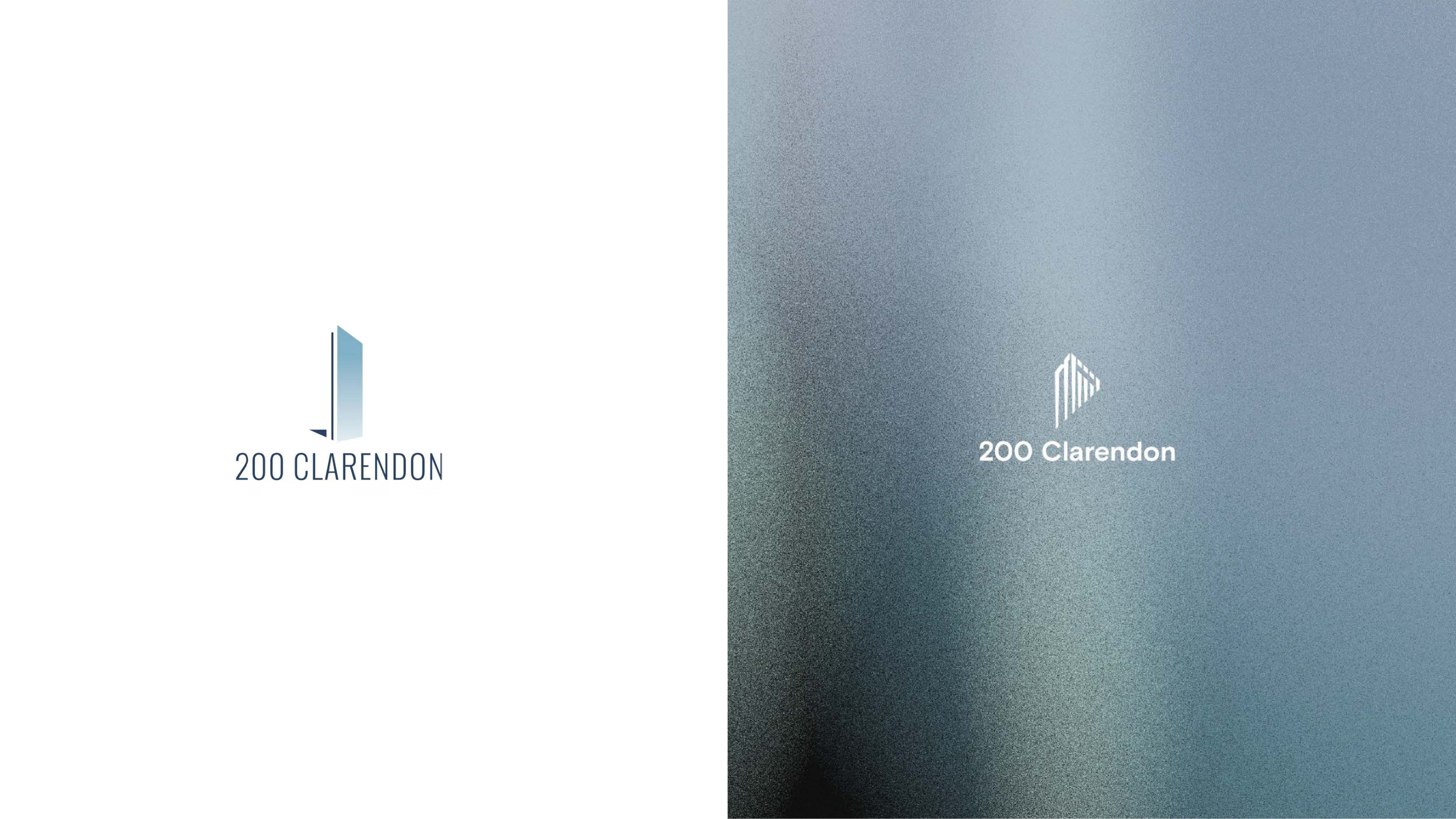 Going into the iteration process, I sought to take advantage and push the recognizability of the building even farther. Inspired by the exterior of the building, core features, like the notch on the side and the darker panes of glass at the top, are used in the new proposed logo, which focuses on the very top of 200 Clarendon. With an angled cut and use of vertical trappered lines to portray the building, the logo has a sense of downward motion, alluding to the height of the building as it extends downward beyond the mark.
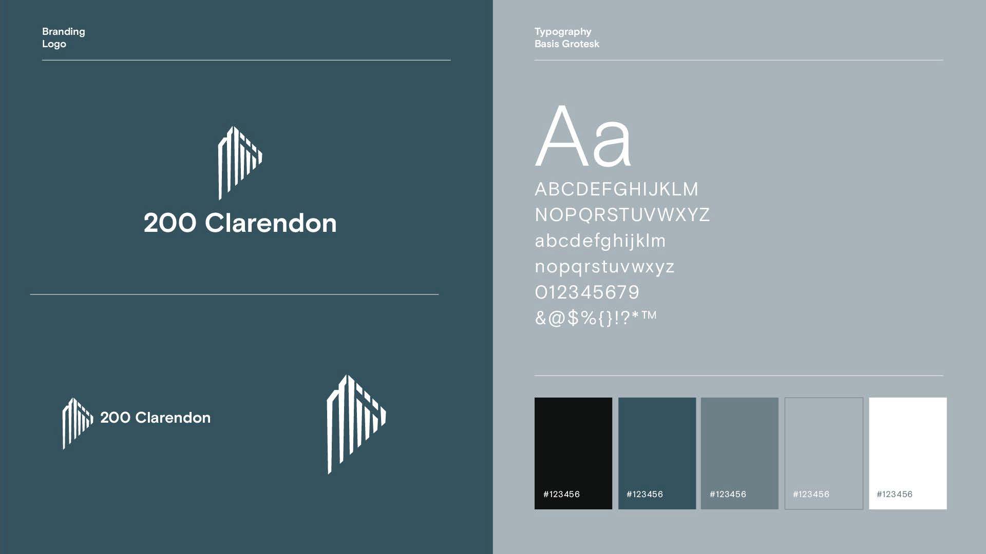
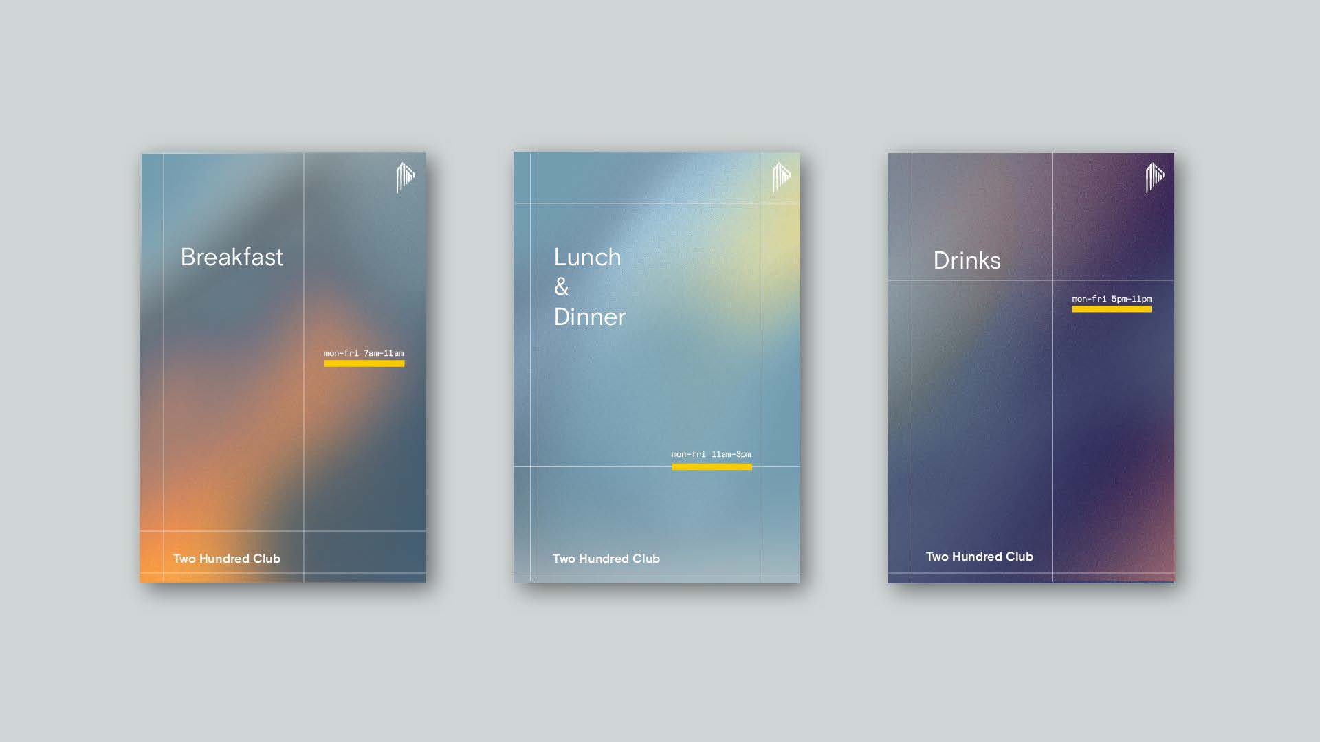
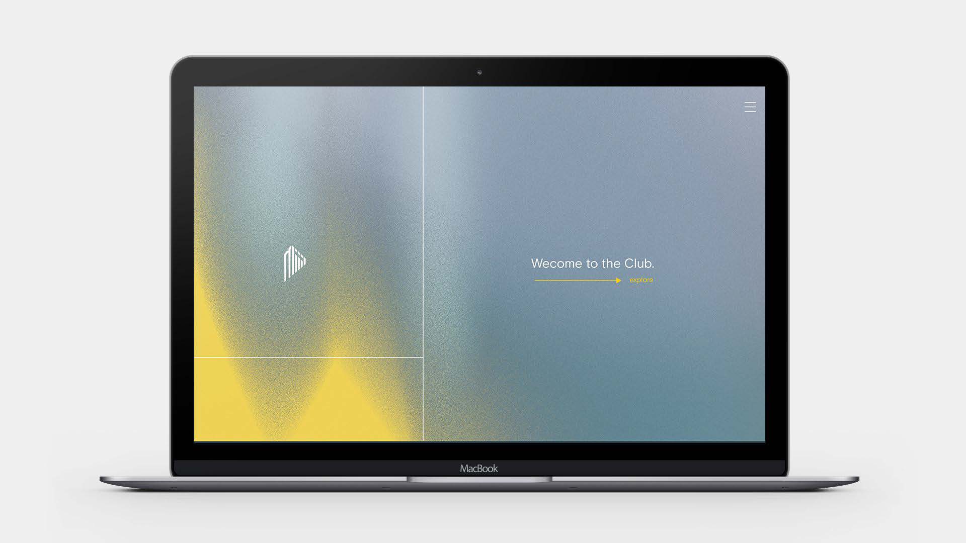
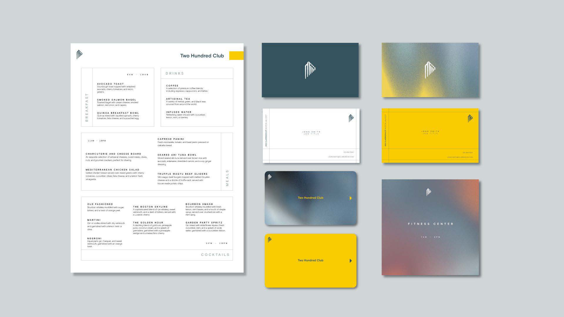
This identity also seeks to highlight the refelctive nature of the building while modernizing the use of a gradient used in the previous mark. Inspired by the sky it reflects, a palette of gradients was created for the identity system.
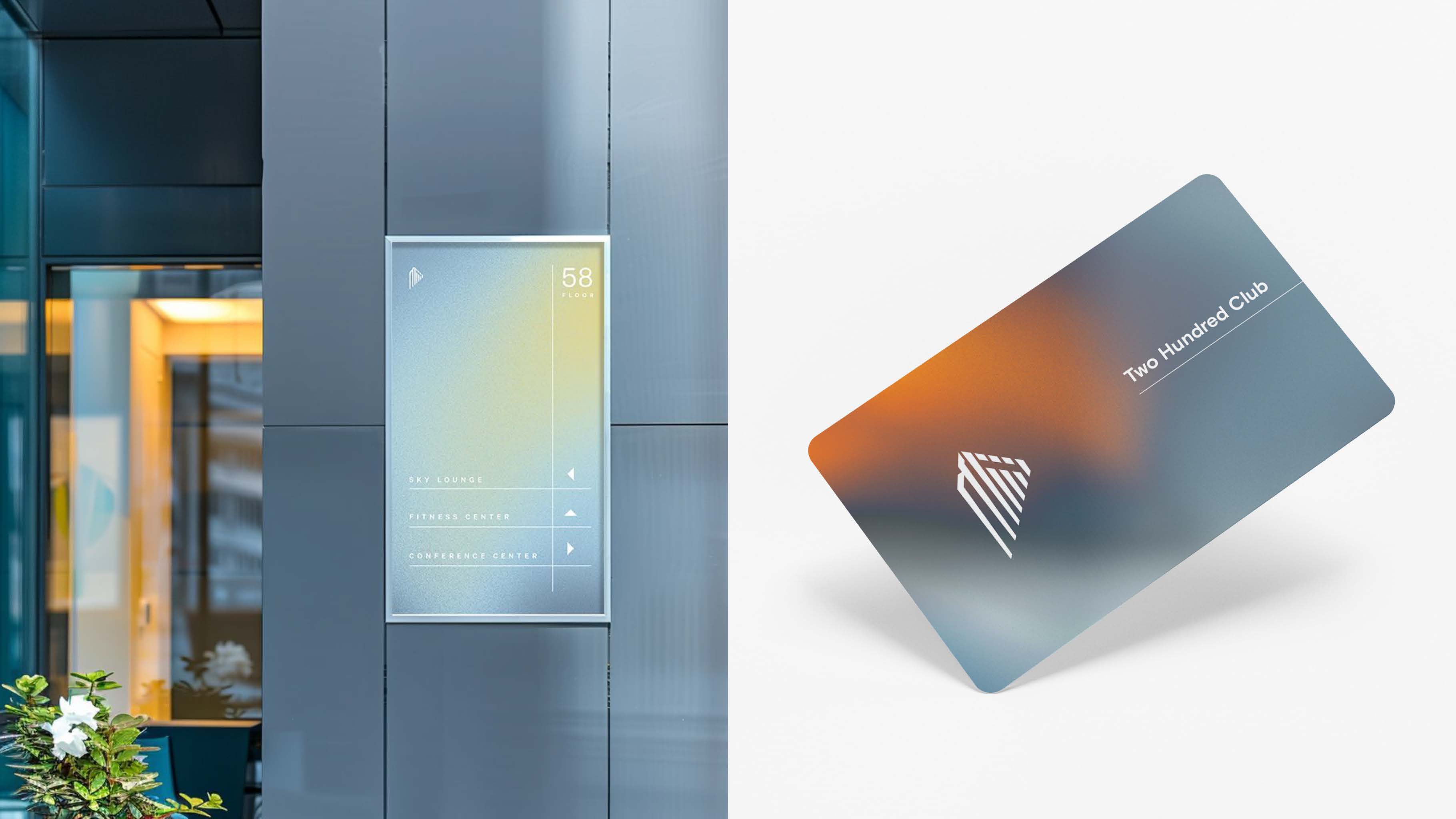
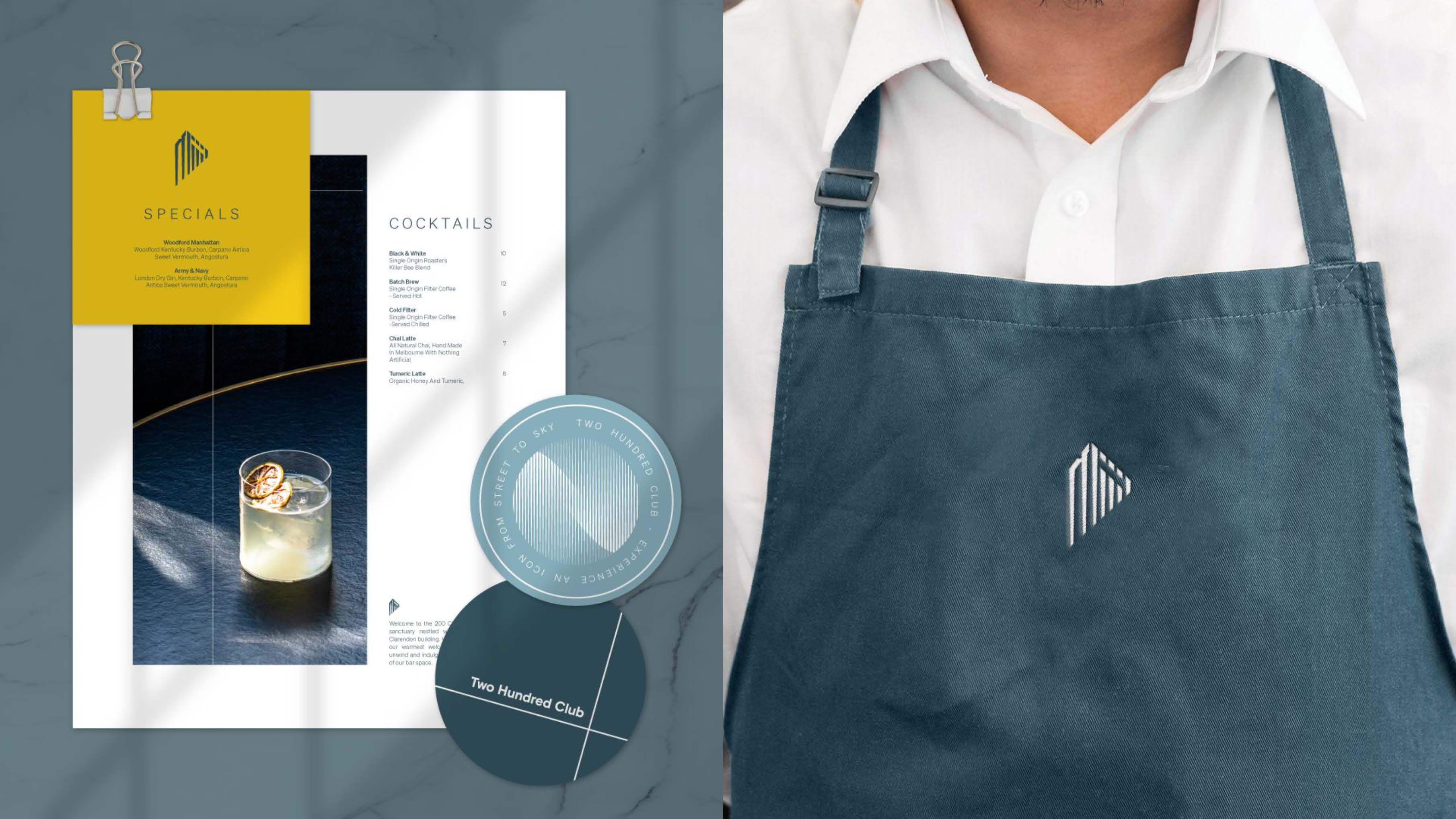
 200 Clarendon is a premier workspace and home to leading financial and investment firms, and BPX seeks to create an amenities space for its tenants that is reflective of the quality of work done within. The Two Hundred Club is an exclusive, luxurious amenities space where tenants can relax and let loose after a hard day of work. Bringing pops of color, this extension of 200 Clarendon pulls in the colors of Boston Strong to create an elegant yet fun look that is reflective of the exterior of the building in both the sky and city pride.


Branding, Research, Layout, Logo Design