
T-Shirt Stencils
Acrylic stencils designed to be spray painted onto t-shirts for events hosted by Wee the People. Wee the People, a Boston-based social justice project that designs high-impact workshops on racial literacy and equity for kids, parents, and educators.
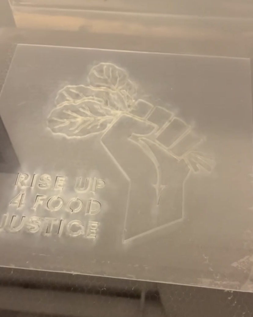
Each design was developed in partnership with Wee the People and laser cut at MassArt by the Center for Art and Community Partnerships (CACP).
Each design was developed in partnership with Wee the People and laser cut at MassArt by the Center for Art and Community Partnerships (CACP).
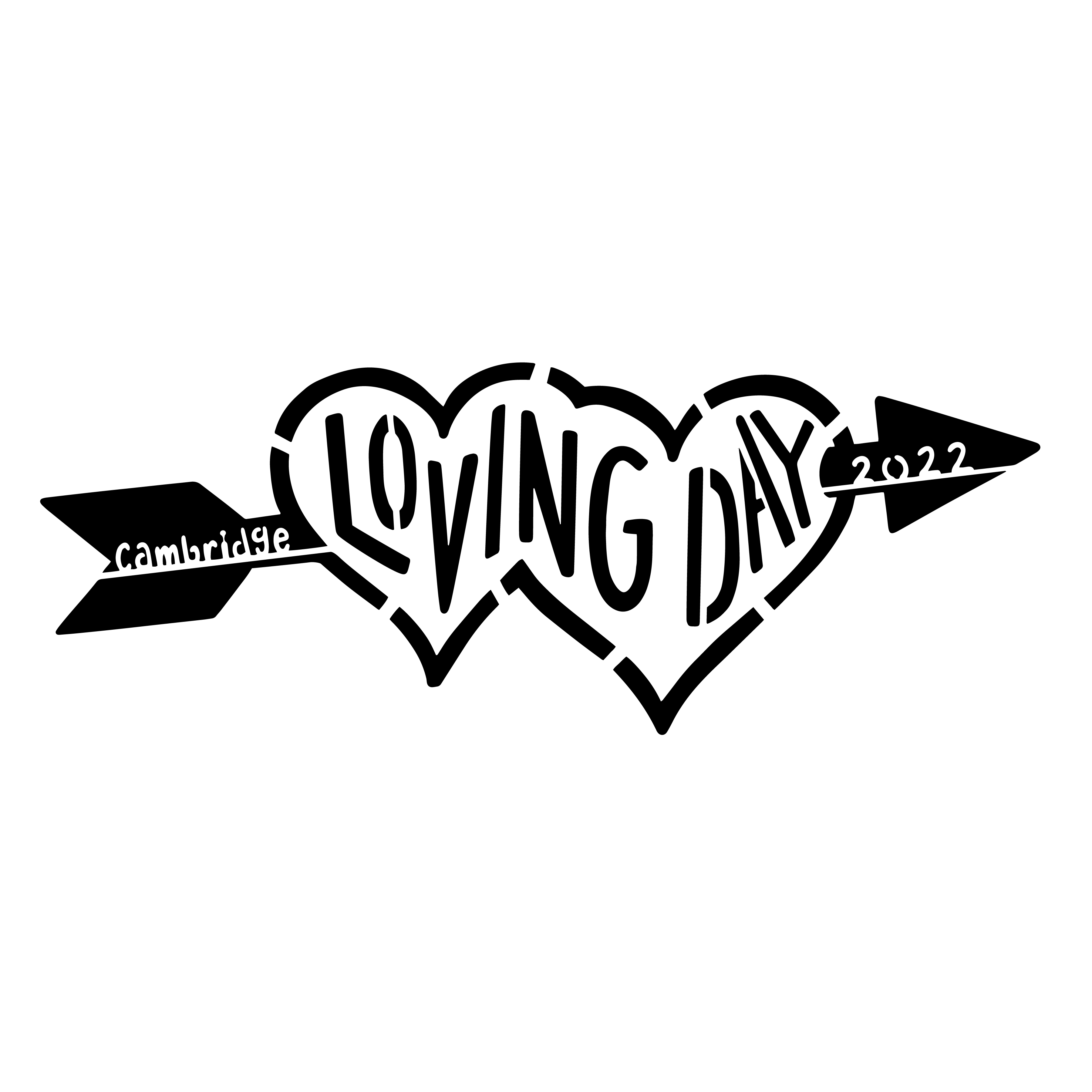
LOVING DAY 2022
Although not a federal holiday, Loving Day is a nationally celebrated holiday that takes place each year on June 12th. It marks the anniversary of the 1967 US Supreme Court Decision Loving v. Virginia which struck down all anti-interracial marriage laws in the United States. The city of Cambridge holds an annual celebration in honor of this historical day and Wee the People took part with a t-shirt table.
The initial plan was to create two different designs, one image-based and one text-based.

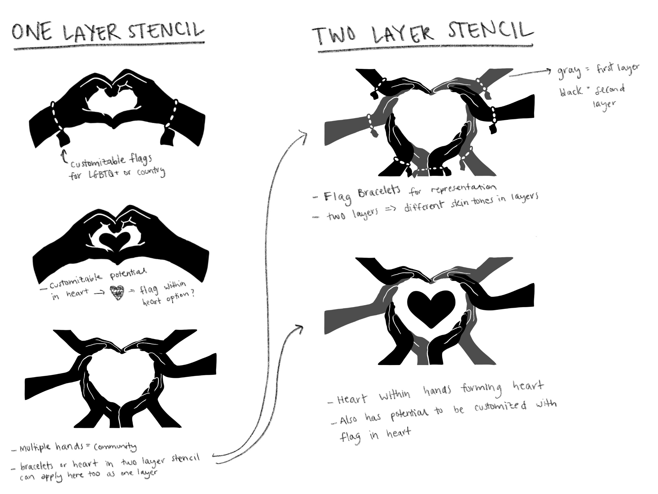
Left: Text-based sketches using an arrow through the heart motif
Right: Inage-based sketches using hands that would allow t-shirt makers to represent themselves and loved-ones on a customizable deisgn.
However, due to time constraints, we ultimately went with a single design that was simple enough to be a stencil, yet conveyed the message equally as strongly.

Once the designs were final, the files were converted for laser cutting, cut by the MassArt laser lab, and delivered to Wee the People.
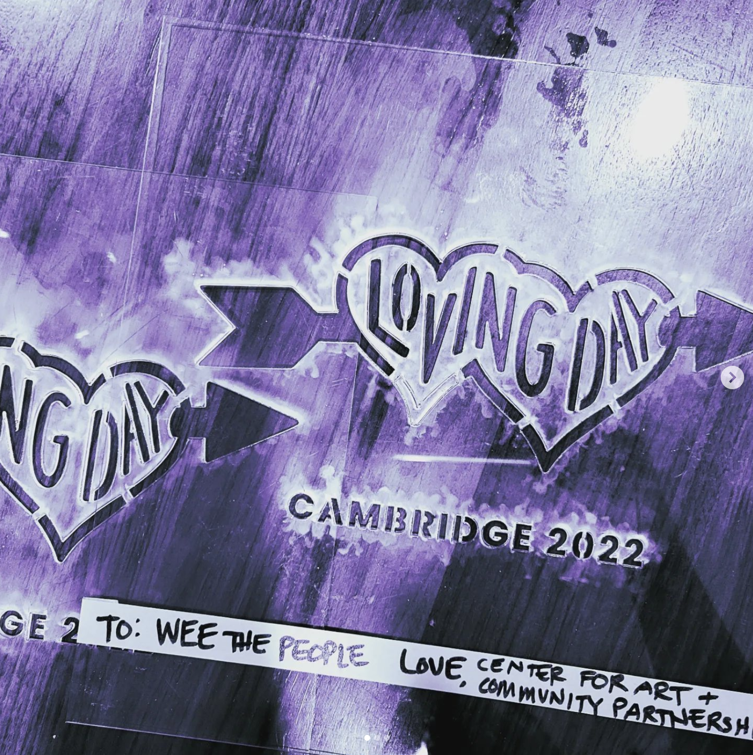
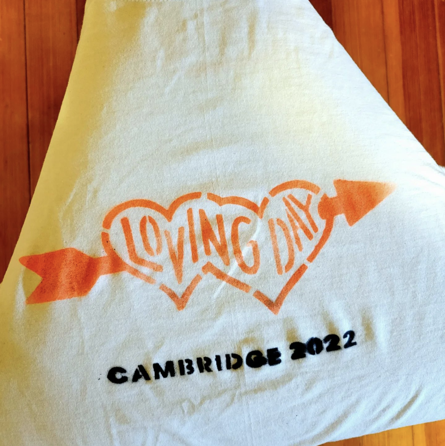
Photos from @weethepeopleboston on Instagram
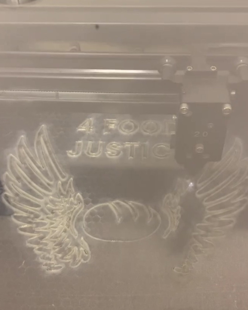
RISE UP 4 FOOD JUSTICE
Wee the People developed a food justice workshop with the Fuller Crafts Museum which was held in early November of 2022. This time around, they had a much more solid idea for the stencils and using the images they sent me, I created the two designs that say “Rise Up 4 Food Justice.”

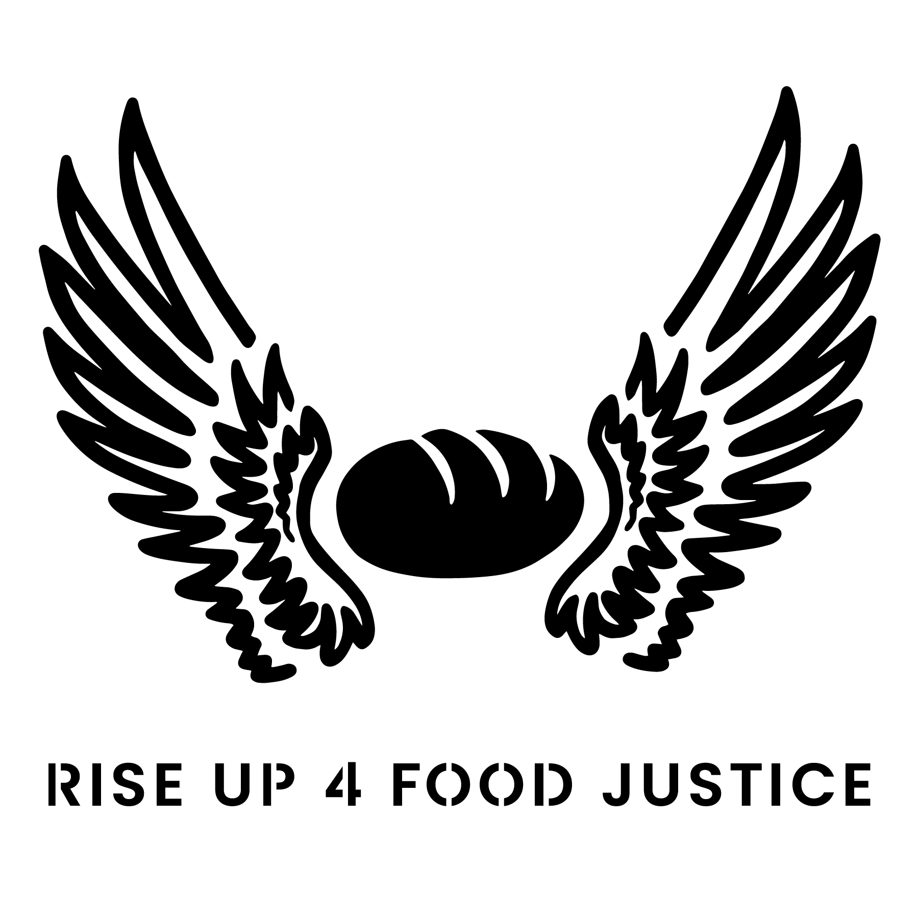
The text in the first drafts felt like they were receeding, especially in the first design, compared to the bold image of the design. For the second round of drafts, I created lockups of the text to not only give it more weight, but also allow text to be larger.

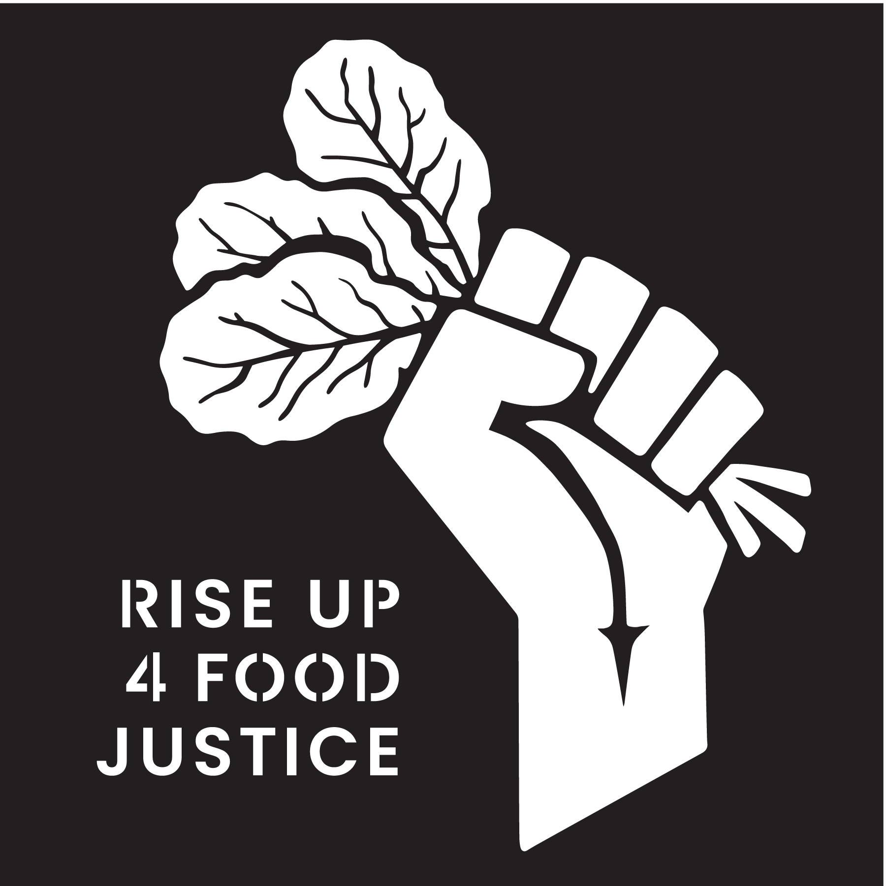
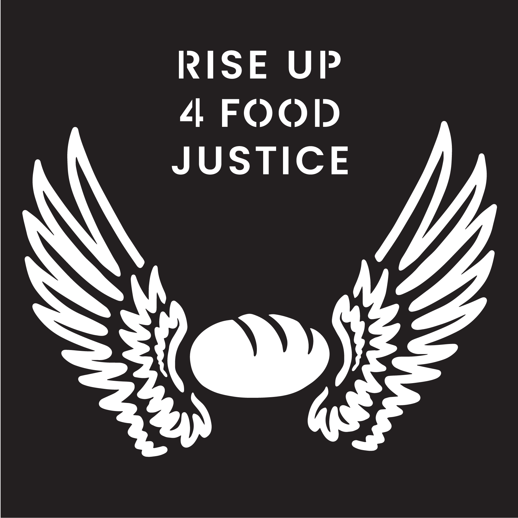
I also looked at the inverse of each design to ensure that there was enough negative space for the stencils to remain strong after being cut out.
Photos from @cacp_massart on Instagram
Created: 2022